
Health · Torrelavega, Cantabria
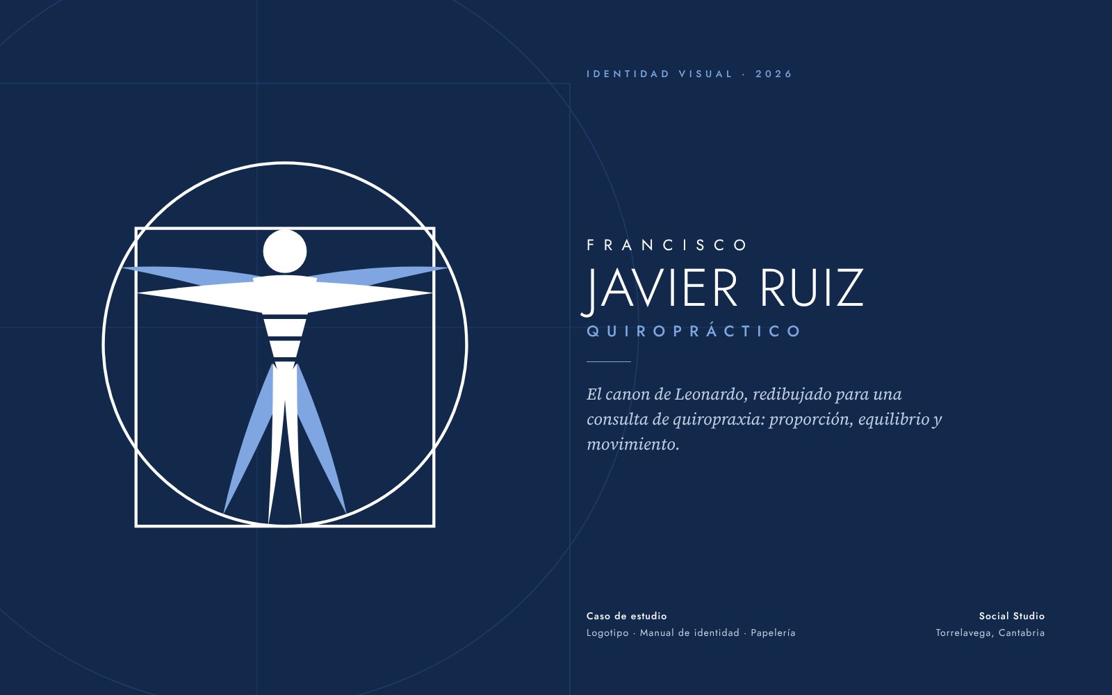
Leonardo’s canon, redrawn
Identity for a chiropractic practice: the Vitruvian Man turned into a geometric symbol with the spine as its axis, two trustworthy blues and 15-page guidelines, from the appointment card to the website.
- Client
- Francisco Javier Ruiz, chiropractor
- Sector
- Health
- Services
- Logo · Brand guidelines · Stationery · Digital
- Year
- 2026
The challenge
The practice already had a logo made for its appointment card: a figure inspired by the Vitruvian Man, with a strong idea but hard to use beyond paper. It needed to be put in order and turned into a system that conveyed clinical trust and worked just as well on an entrance plaque, an envelope or a WhatsApp icon.
The process
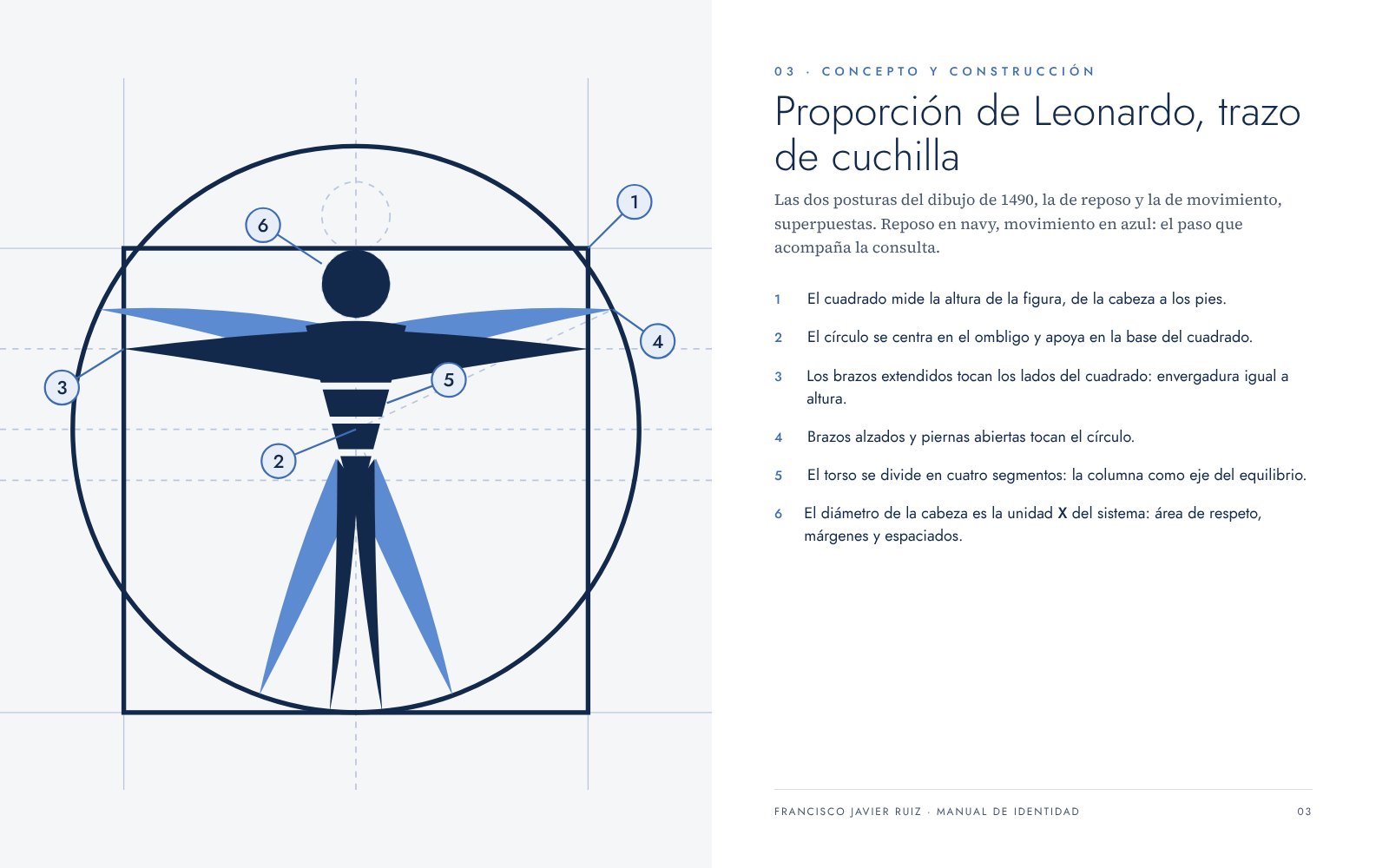
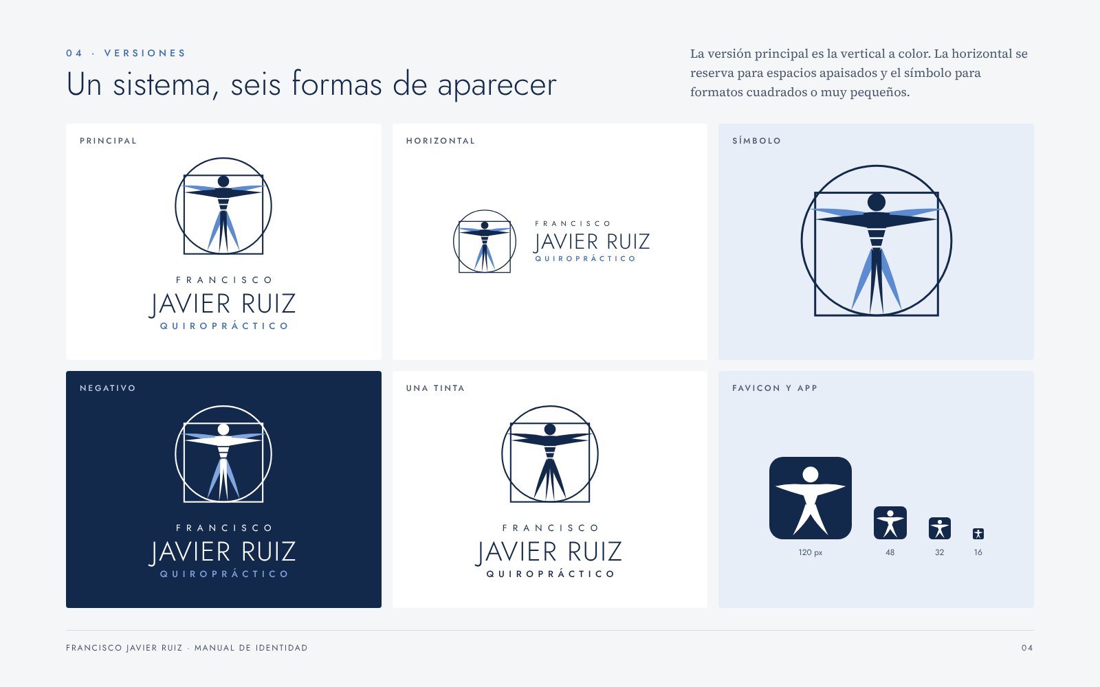
We didn’t start from scratch: we kept what worked (the figure with blade-like arms, the circle and square, the spaced-out lettering) and rebuilt it on the real geometry of Leonardo’s drawing. The torso became a column of vertebrae, the double pose was solved with two flat blues instead of the original gradient, and we tested the symbol at 16 px to create small-size versions.
The solution
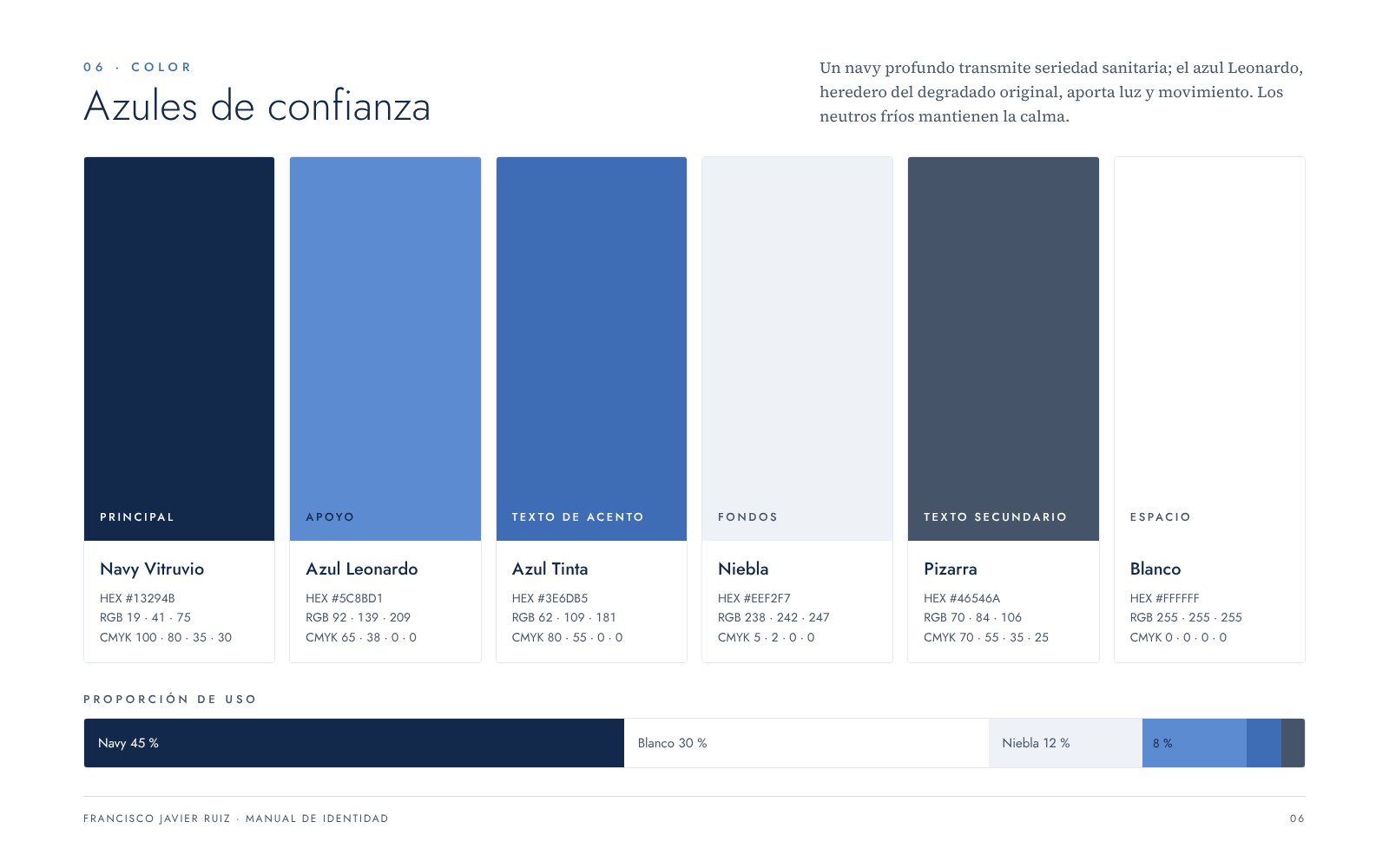
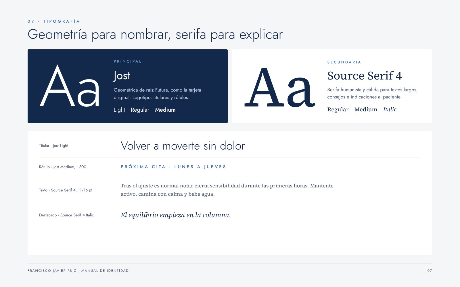
A symbol with canonical proportions, a deep navy with a supporting blue and cool neutrals, Jost for naming and Source Serif 4 for explaining. The guidelines cover construction, versions, clear space, colour, typography, graphic elements and incorrect uses, along with every application.
The result
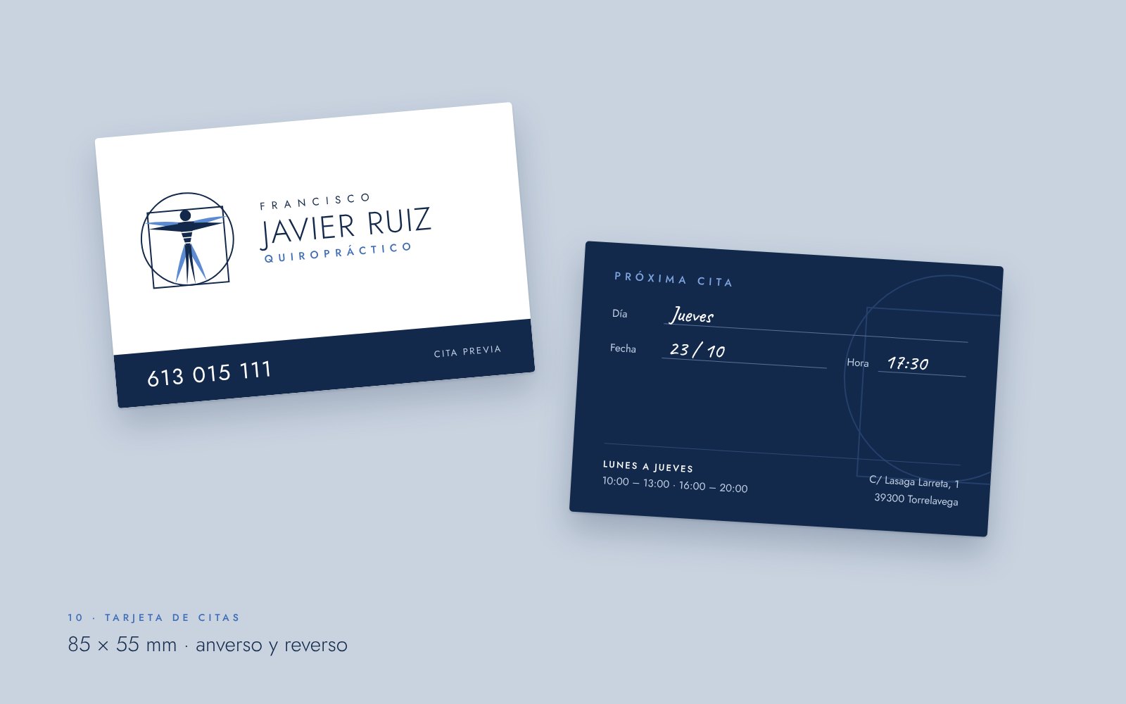
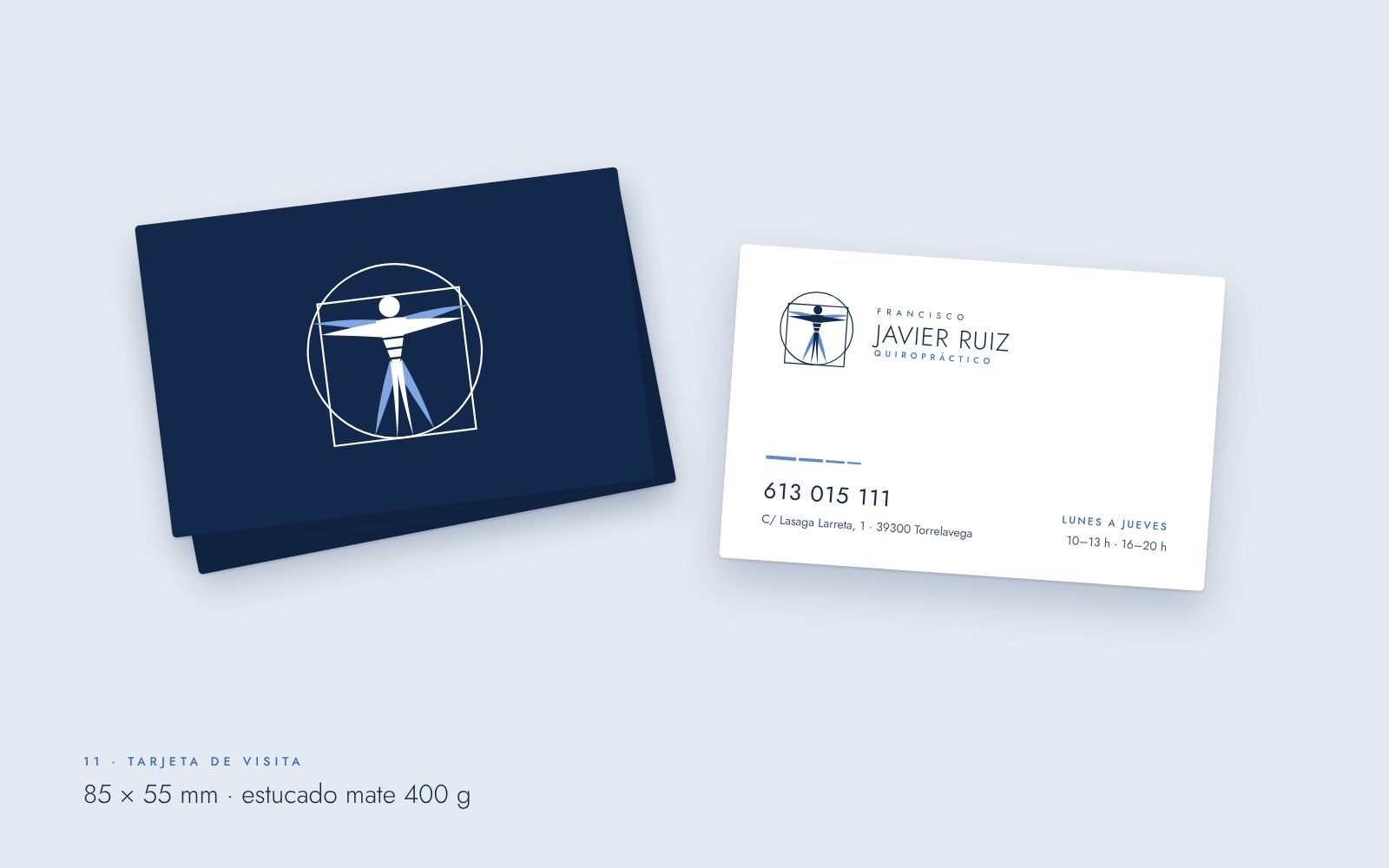
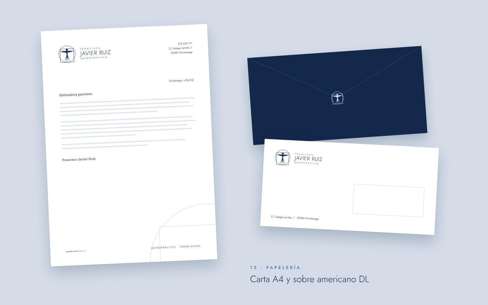
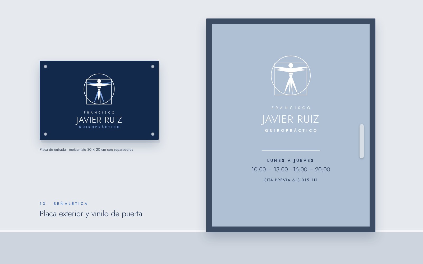
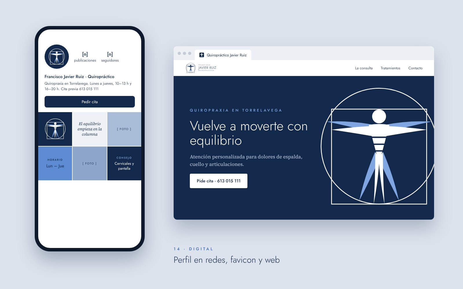
A serious, recognisable brand that reads the same at 85 × 55 mm as on an outdoor plaque or a phone screen. The original appointment card evolves without losing its essence, and the practice now has every piece ready: stationery, signage, social profile, favicon and website homepage.
Gallery
Shall we do yours?
Tell us about your project and we’ll propose how to bring it to your brand and your social media.